I have a great before and after to share with you today. This client was the sister of some lifelong friends. She and her family recently moved into their new home, but weren’t in love with the kitchen.
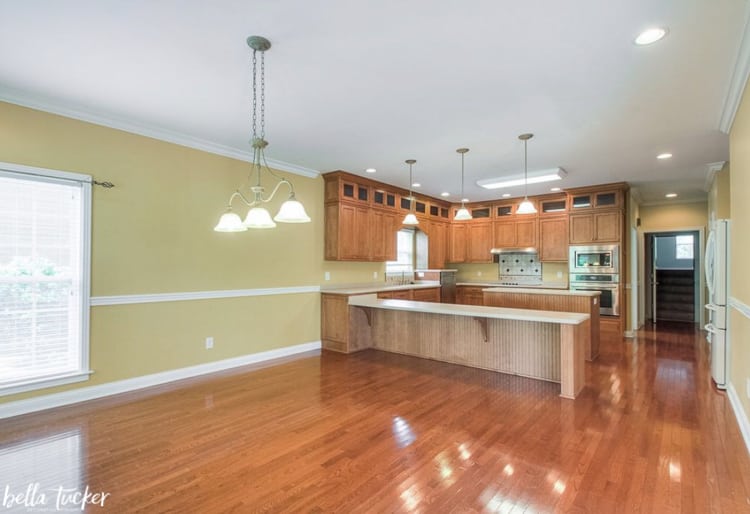
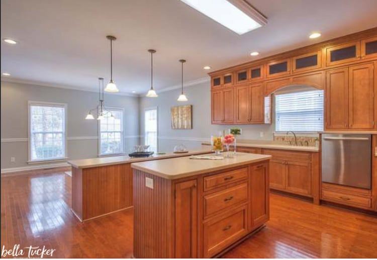
The kitchen had lots of great things going for it, like tons of beautiful quality cabinets, a generous foot print, and updated appliances.

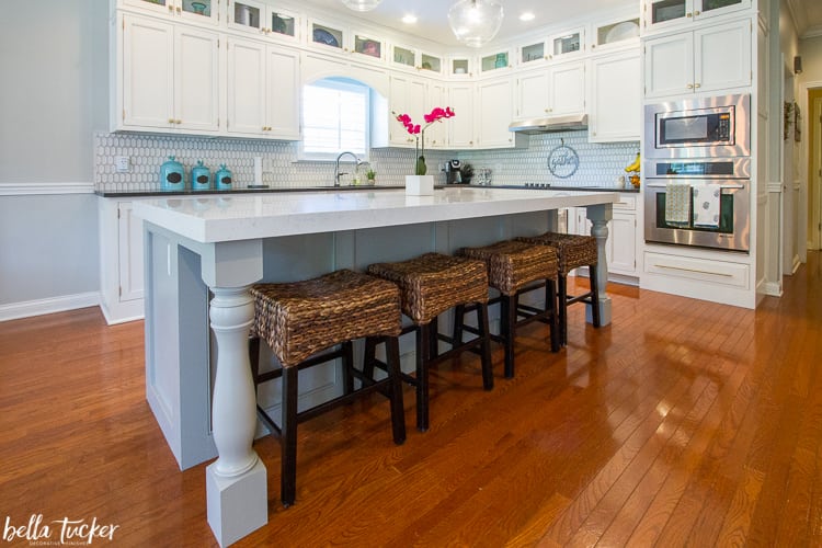
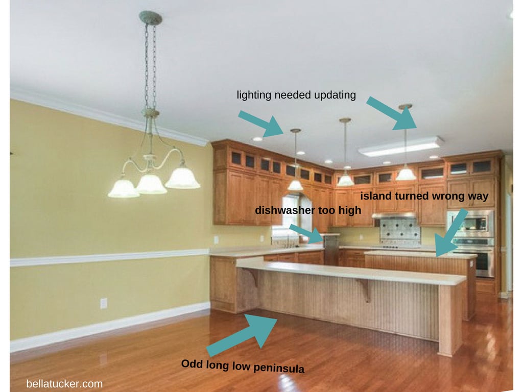
There were a few odd things though that the homeowners wanted to address in their update. This kitchen may have originally been designed for someone in a wheel chair.
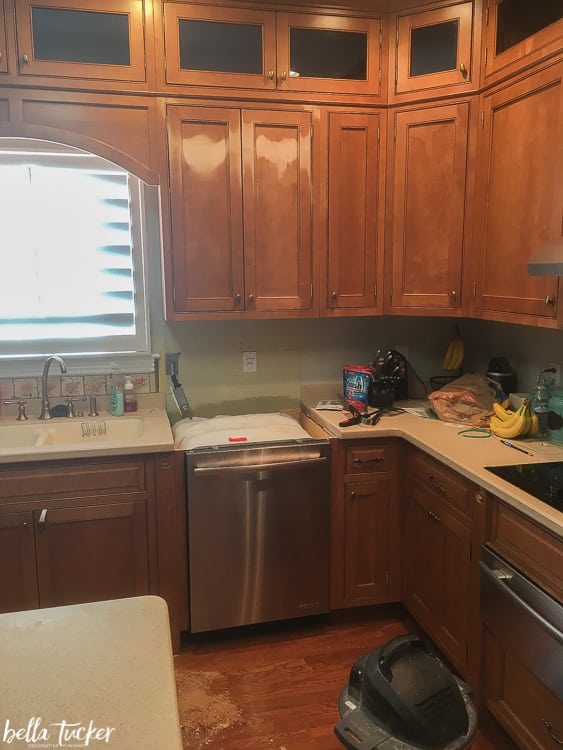
- There was a long oddly placed peninsula that divided the kitchen. That needed to come out.
- The dishwasher was raised up off the ground. They wanted this lowered back down to cabinet height.
- The island was turned in the wrong direction. We suggested they turn it around and extend it.
Additional update action items were:
- Replace the countertops
- Add a new tile backsplash
- Update Island Lighting
- Match the cabinets on either side of the sink once the dishwasher was moved down.
- Add decorative legs to the new island.
- Paint all the cabinets.
- Install new hardware
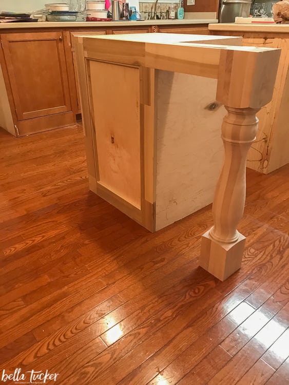
Our carpenter got to work on the structural updates. He first removed the long low peninsula. Then, the cabinet on the very end needed to be turned so that the door could be accessed from the new front of the cabinet.
He lowered the dishwasher cabinet which left an unfinished cabinet on top. He evened it up and matched it with the top cabinet on the other side of the sink.
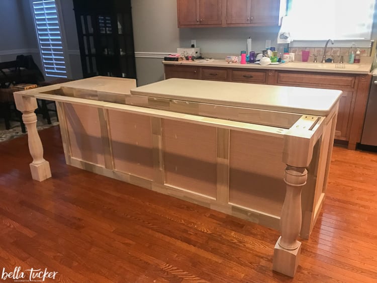
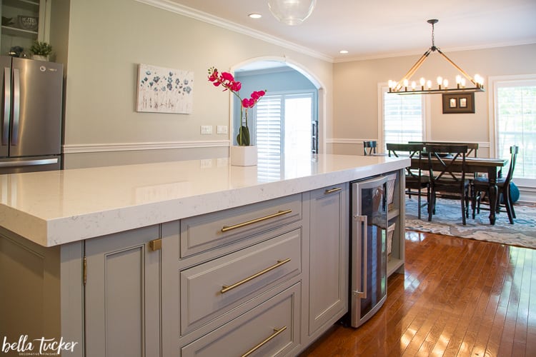
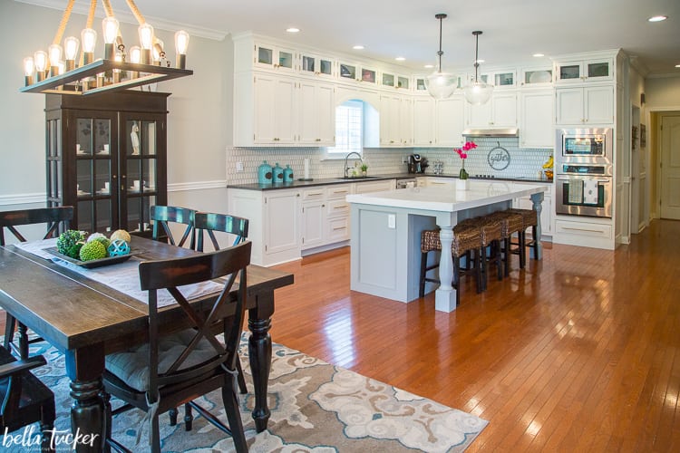
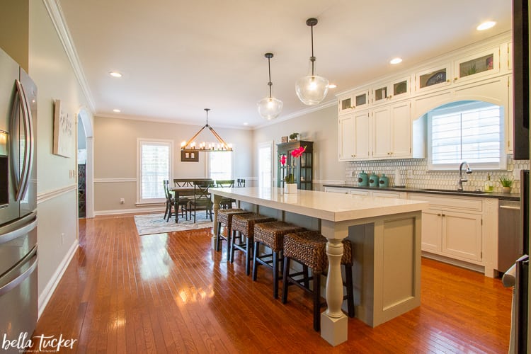
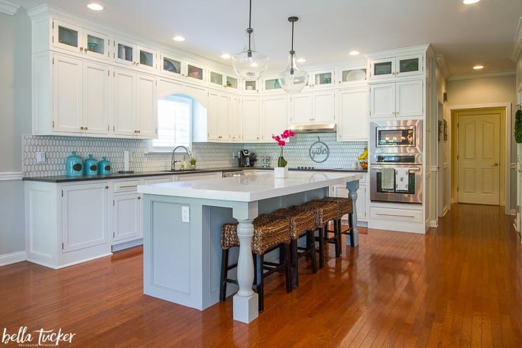
Then he turned the island so that is was parallel with the sink cabinets. Luckily there were hardwoods underneath the island, so we didn’t need any floor repairs. He extended the length of the cabinet by adding some open shelving and room for a new beverage fridge.
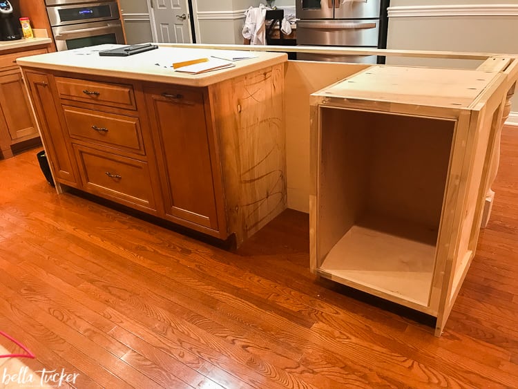
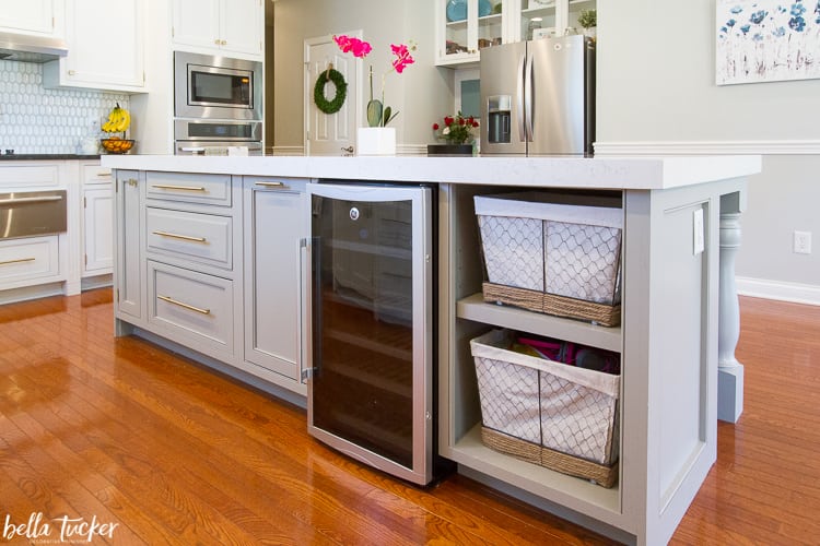
This saved our clients money because we didn’t have to build or order a new cabinet 🙂 And he also added beautiful turned farmhouse legs to create an anchor for the new countertop.
We doubled the useable space of the island.
This new layout- REALLY- opened up this kitchen.
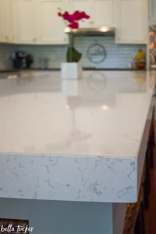
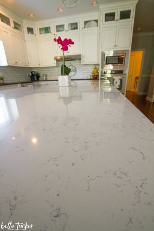
Next, we had new countertops installed. My clients loved the look of two different countertop materials. We selected a white quartz with gray flecks for the island top. Fairy White Quartz by MSI. We had it fabricated with a 3″ mitered edge which adds such a WOW factor.
For the perimeter countertops we selected a Steel Gray Leathered Granite. It has an amazing texture when you run your hand across it. Love it!!
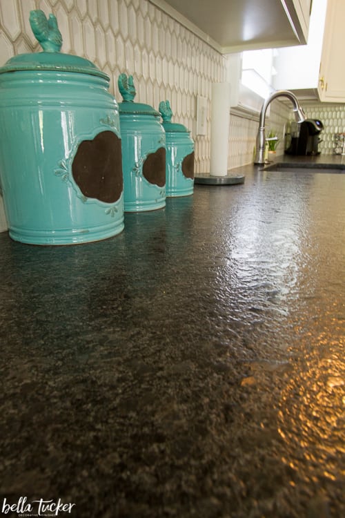
We installed this beautiful picket mosaic tile on the backsplash.
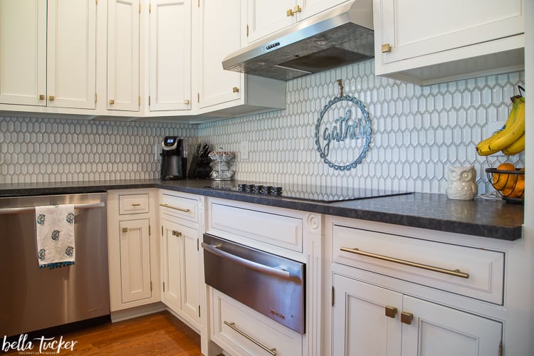
Painted the cabinets. Sherwin Williams 7017 Dorian Gray on the Island and Benjamin Moore OC-17 White Dove on the cabinets.

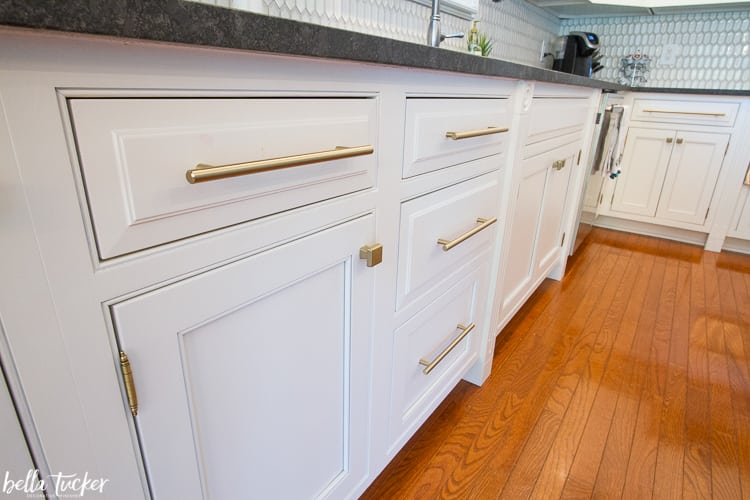
Installed new brass hardware.
Installed two clear glass pendants over the island.
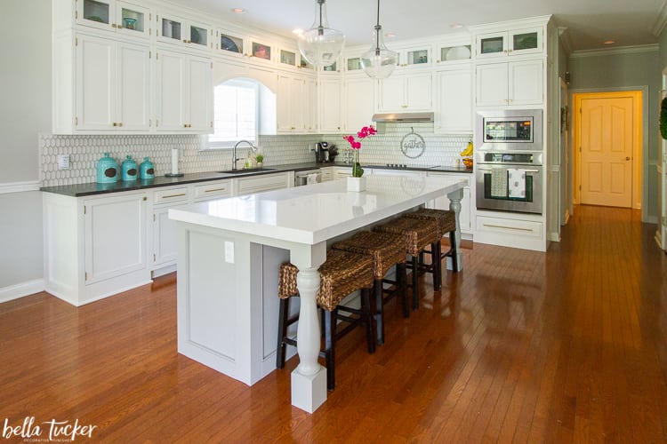
Now, the Not Quite Right Kitchen is the Just Right Kitchen!!!
BEFORE/AFTER
If you have a kitchen that is just not quite right, we’d love to talk to you. We do everything from custom cabinet painting to full kitchen project management and design. Fill out the form below if you’d like more information.
Contact Form
We would love to hear from you! Please fill out this form and we will get in touch with you shortly.


Hi! What a great transformation! Can you tell me the wall color?
Thanks! I think it is Benjamin Moore Coventry Gray.